Showing posts with label Signature member. Show all posts

Thursday, September 16, 2010

Two Members of the SAA ‘Family’ are gone


A sad message from 
the president of the Society of Animal Artists…

It is with a heavy heart and much sadness that I inform everyone about the recent passing of two Society of Animal Artists family members.

Marijane Singer, long-time Patron member and Director of the Hiram Blauvelt Art Museum in Oradell, NJ, passed away this past Sunday, September 12, 2010.

Long-time Signature member Robert Salo also passed away suddenly and unexpectedly on September 13, 2010. He lived and breathed the SAA, and was responsible for the SAA Art and the Animal tour coming to Estes Park, CO in 2008. His wife, Jeanne, asks that any memorial contributions in his name be made to the Society of Animal Artists. What a wonderful tribute to his spirit and his devotion to our organization!

-Diane Mason


Marijane Singer


Marijane Singer, a cultural and civic volunteer who was director of the Hiram Blauvelt Art Museum in Oradell, a showcase for wildlife art, died Sunday. She was 80.


"We're known internationally but we aren't known locally," Mrs. Singer said in a 2008 interview with The Record, referring to the museum lodged in an 1893 carriage house on the former Blauvelt estate overlooking Kinderkamack Road. "If you aren't into wildlife art, you probably never heard of us."

But wildlife artists heard of Mrs. Singer. She became the museum's director about 25 years ago, after she joined the board of the Blauvelt-Demarest Foundation, a legacy of the philanthropist Hiram Blauvelt. Guy Coheleach, whose work is currently exhibited at the Blauvelt, said Mrs. Singer raised the profile of the museum, one of a handful in the United States dedicated to wildlife art.

"She was influential in getting the Society of Animal Artists, the largest and most proficient group of wildlife artists, to have their annual show at the Blauvelt a couple of times," said Coheleach, of Hobe Sound, Fla. (Read more)


Robert R. Salo
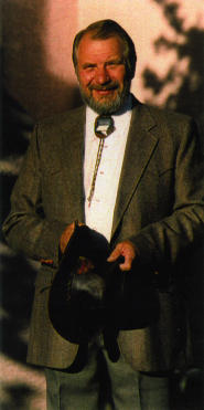


Robert (Bob) Salo's love of nature and wildlife began early. As a boy growing up in Michigan's remote Keweenaw peninsula, Bob spent hours studying and drawing the animals, farms, and forests of that spectacular region.


Following a tour of duty in the U.S. Army, Bob received his first formal art instruction at Meinzinger Art School in Detroit, where he studied under George Rich.

While working for many years as a commercial artist and fine arts illustrator in Detroit and Boston, Bob continued to celebrate his love of nature through wildlife and landscape painting in his free time.

Bob fulfilled a lifelong dream when he moved to the outskirts of Colorado's Rocky Mountain National Park. In Colorado he perfected his painting skills, devoting his full time to capturing that area's wildlife and scenery on canvas. His work in Boston introduced him to New England's rural charm and seaside beauty.

Bob Salo's paintings can be found in galleries and museums, as well as in private and corporate collections in the United States and abroad. He is a signature artist member of the Society of Animal Artists [SAA], and has been exhibited in the prestigious national tour ARTS for the PARKS numerous times.

Bob's wife Jeanne has requested that in lieu of flowers, memorial contributions be made to the Society of Animal Artists, as that was so near-and-dear to Bob's heart. As a member of SAA for nearly 30 years, that is an honor he well deserves.


(rc)

Thursday, July 15, 2010

Congratulation to Joy Kroeger Beckner


Congratulations to SAA artist Joy Kroeger Beckner for all of recent achievements and awards!


Joy Kroeger Beckner's bronze "Sweet Roll" SS (Standard Smooth), earned the Lindsey Morris Memorial Award, in the 96th Annual Show of Allied Artists of America.
The 1:6 Scale "Sweet Roll" earned the Best Sculpture/Metal, in the Seaside Art Gallery, 18th International Miniature Art Exhibition, Nags Head, NC.


Joy's bronze "Sunnyside Up" (longhaired version), earned the Best Sculpture/Metal, in the 19th Annual International Miniature Art Show at Seaside Art Gallery, Nags Head, NC.


Joy's bronze "Siesta" SS (Standard Smooth), earned The Agop Agopoff Memorial Award in the 79th Annual Exhibition of The Hudson Valley Art Association, NY. See it through July 30 at the National Arts Club, 15 Grammercy Park South, New York, NY. "Siesta" SS may also be seen in Art on the Avenues, Wenachee, WA, through April 2011.


Joy's bronze medal, "Inspiration" may be seen in two medallic art shows this summer:
Fédération Internationale de la Médaille d' Art, FIDEM XXXI Congress and Exhibition, The Tampere Museum, Tampere, Finland. Through August 29.
AMSA with The ANA (American Medallic Sculpture Association with The American Numismatic Association), Hynes Veterans Memorial Convention Center, Boston, MA. August 10-15, 2010.

 
To learn more about Joy's work, please visit www.joybeckner.com .


(rc)

Wednesday, July 14, 2010

Composing with Al Agnew


We saw a couple of weeks ago one of our artists, Al Agnew, share his composing of a new painting on Facebook and thought it would be wonderful to share it here… Al has graciously shared his method of composing his recent fox painting with us along with images of the different stages.

Thank you, Al!

Composing a painting using Photoshop

with SAA artists Al Agnew


For me, working out the design of a painting used to involve a lot of looking through my collection of reference material, a lot of drawing and re-drawing of the subject matter to work out details not included in my reference photos, and a lot of thumbnail sketches to work out the placement and proportions of the major elements of the painting. I have always enjoyed the sketching and drawing process, but it was time-consuming and sometimes frustrating. And at the end of it, I still had just a preliminary monochrome drawing of the painting. I never liked to do color studies because they always seemed to take away some of the spontaneity in the painting process once I got to the final painting. So often I would begin the actual painting with the idea of the whole color scheme nowhere but in my head.


Enter Photoshop. The computer, along with digital photography, has been one of the greatest things to come along when it comes to managing reference materials, and the Photoshop suite of applications has really changed the way I work. My recent fox painting is a good case in point.


The genesis of the idea for this painting was simply that I wanted to paint a red fox. I had no particular idea in mind, unlike some paintings, where the idea is in my head before I begin. For instance, the last red fox painting I did started out with me doing the kind of "doodling" thumbnail sketches of critters that I often do while sitting in the living room at night. I came up with a pose I really liked of an unspecified canid—could have been a wolf, coyote, or fox. But it ended up being a fox after a lot of re-drawing, and some studying of various fox photos and drawings from life I had done over the years to make sure the details were right. I had no reference that was anywhere near the pose I had come up with originally, so the photos were only helpful in working out a few details.


But this time I had no pose or background in mind. In that case, I usually just start looking through my reference material, waiting for some image to turn me on. I had decided I wanted the painting to have a Western setting, though not any vast landscape with an easily recognizable locale, so the first group of reference photos I paged through was photos I'd taken over the last few years of locations around our cabin in Montana. This is where the Photoshop suite has first streamlined my working habits.


Before digital photography, I took most of my animal reference photos with print film, and the landscapes with slide film. I wanted colors to be as true as possible on the landscapes, which slide film best accomplished, while with the animals the exact color wasn't as important and it's easier to work from prints than from slides, which require some method of viewing them while working. I have a huge set of slide drawers full of slides, and five large drawers full of prints, categorized by locale, species, and pose—for instance, my fox photos, taken over many years from animals both in the wild and in captive situations, are divided up into "close-ups", "young", "action poses", "lying and sitting", "standing facing", "standing broadside", "standing away", "walking facing", "walking broadside", "walking away", "running facing", "running broadside", and "running away".


Since I've been taking print and slide photos for more than 20 years, and have only taken digital photos for the last six or seven years, my digital library isn't quite as large, but if I've taken a lot of digital photos of an animal, I'll have those photos categorized the same way, placed into various folders with the same names as my print photos. Eventually I'd like to digitalize all my prints and slides, but with tens of thousands of non-digital photos, it's a time-consuming and expensive process.


At any rate, I can easily browse through my digital photos on the computer using Photoshop Bridge, which is a wonderful photo management tool. Call them all up on the screen, browse quickly through them, zoom in on anything that looks interesting, and send it to Photoshop.


One photo immediately caught my interest. It was this one, (Above), a photo I'd taken on a hike Mary and I had done at the headwaters of Tom Miner Creek near Yellowstone Park. I loved the complex design of the cluster of roots and trunks of these pines, and the play of sunlight and shadow. However, I didn't like the background, because it didn't look like typical red fox habitat in the West. Red foxes prefer areas with grasses where they can hunt mice, and the background on this photo looked too sterile.


I also did not want this painting to be a summer-time scene, since one of the joys of painting foxes is depicting their luxurious coat, and summer coats are not all that luxurious. So I downloaded the photo into Photoshop and continued looking. I soon came upon this photo (Above), which was a grove of autumn aspens I'd taken along the highway approaching Yellowstone Park from the south. I imported it into Photoshop. So now I had a foreground and a background, but I still wanted to show some grass to give it the feel of good fox habitat, so I picked out one of my many photos of grassy areas in Montana and Wyoming and imported it.


I decided I wanted the fox to be coming through the trunks toward the viewer, as if it had been hunting the grass but was sticking pretty close to cover in the bright daylight. I don't have many digital fox photos, so it was time to dig into my old print photos. I started flipping through the "walking facing" section of my red fox photos and soon came upon this one (Above). I liked the general look of the fox, but of course the photo had several basic flaws—it was a winter photo in snow, the fox's foreleg was lifted much higher than I liked, and it was taken on a very dark, cloudy day with no light and shadow and dully colored fur. But I scanned it and imported it into Photoshop.


At this point, I had a good idea of the basic elements of the painting, but was far from sure how they would all go together. I still find that I'm able to think best with a pencil in my hand, so I did a quick thumbnail sketch or two of what I had in mind for the composition while looking at the photos arranged in Photoshop, mainly working out the dimensions of the painting (its aspect ratio—how wide it would be compared to height) and the size of the fox and other elements in the painting. After I had that worked out to my initial satisfaction, I opened a new, blank canvas in Photoshop that had those dimensions.


I selected the entire aspens photo, photo number two, and dragged it onto the blank canvas. That would be layer one, the layer that is underneath the others. I scaled it to be a little smaller than the total canvas. Then I selected an area of grass, using the lasso tool, from my photo of a grassy area, and dragged and dropped the selection into my growing canvas. It would be layer two. I scaled it to roughly fit the area where I wanted it to be visible, which was a small section on the left of the design. Then I selected and dropped in the photo of the pine trunks, making it layer three. This layer almost totally covered the other layers, because I'd brought the whole photo, including the background landscape, into the composition. So I then had to use the eraser tool to erase all of the background, after scaling the photo so that the tree trunks roughly fit into the design the way I wanted. Erasing the background areas let the underlying layers of aspens and grass show through the erased areas. This is where another terrific computer tool comes in very handy, and that is a Wacom tablet, a pressure sensitive monitor upon which you can draw directly with a stylus. I was able to use the stylus on the screen just like using a very sharp and precise pencil eraser to remove the areas of the tree trunk layer that I didn't want.


Finally, I went to my scanned fox photo, and used the lasso tool to carefully outline the fox and separate it from the background. Again, the Wacom tablet and stylus was extremely helpful. Instead of having to use a mouse to draw the lasso around fox, a process that would be awkward at best, I could actually just trace around the outline on the screen with the stylus. Once I had the selection finished, I dragged and dropped it into my Photoshop canvas. It became layer four, the uppermost layer. I flipped it horizontally and scaled it to be about as big as I wanted in the design.


Then it was a matter of playing with the four layers, moving them around slightly, making them a little bigger or smaller, working out their relationship in size and location. For instance, I reduced the background aspens a bit, and enlarged the pine trunks so that more of the trunk on the right bled off the image. I moved the fox around until I had what I thought was the perfect placement of it in the composition and reduced it slightly to make it more proportional to the trunks. All of that resulted in the entire composition looking like this: (Below)


At this point I had several obvious color-related problems. The lighting strength and direction in the foreground and background was pretty well matched, but the light "color cast" of the aspens was more golden yellow overall than the rather clear, white light on the foreground trunks. And that fox, of course, had no strong light at all. In addition, there was little contrast between the aspens and the pine trunks—in fact, the trunks seemed to be lighter in value than the aspen background, which made the whole scene confusing. So first I had to make those aspens recede into the background, and I did this by adjusting the levels of the aspen layer, making it appear much lighter, as if there was some atmosphere between it and the viewer. Then I selected the foreground layer with the tree trunks, used the levels adjustment to make it appear darker, and started playing around with the color balance, adding more yellow and a bit more red to the middle range and highlights until the color of the foreground seemed to fit into the colors of the background better. The grass, flooded with sunlight in my original photo, now fit both the other landscape elements well.


Then, I selected the fox layer. I first used the saturation slider to make the overall color of the fox stronger and more saturated. I used the brightness and contrast sliders to darken the fox a bit. Now I had the fox's colors looking like it was totally in shadow. Using the paintbrush tool, I selected a bright, light orange and a thin brush, and actually "painted" patches of the fox to look like dappled sunlight hitting its back. Then I began working out the way the light would be hitting the fox's face, the most important single piece of the painting. Because of its importance, it was imperative to figure out to my own satisfaction exactly how the light would fall on it. To that end, I grabbed a small sculpture of a wolf head that I've had for many years, and directed a strong light on it from the direction light would be coming in the painting, noting where the edges of light and shadow fell. In order not to mess up the fox's face during the trial and error I'd be doing in working out the conversion from wolf facial features to fox facial features (something I can do because I've studied both animals extensively), I opened a new, blank layer upon which to "paint" the bright highlights of the fox's face. Then I painted them in. Picking a few related colors, I modified the colors of the bright highlights hitting the fox's fur until I was satisfied it looked like the right color of sunlight dappling the moving critter.


Then I had to consider that the fox would be throwing a broken shadow on the ground and roots under it. To add these pieces of shadow, I picked a very dark, grayed blue-violet color, an airbrush painting tool, and set it to "paint" very transparently. I drew in the shadow areas on the ground that I wanted. Using the dark color and doing it transparently, the details in ground and roots still showed through, and I was able to build up the darkness of the shadows gradually until it matched the shadow areas already in the original photo.

So at that point, I had a finished composition AND a terrific color study, all in one. This is what the final design looked like: (Below)


As I mentioned before, there were things I didn't like about the fox's legs. It was time to get back into "real" drawing. I needed a full-size drawing of the fox to transfer to my "real" canvas before beginning the painting, so as I drew the fox on a separate sheet of paper, I changed the legs and tail to what I wanted, making the tail swing more to the left, lifting the visible hind leg a bit higher, and putting the right front leg more out in front with paw lower to the ground. After drawing the major outlines of the tree trunks and roots onto my canvas, I added the fox using carbon paper, and I was ready to begin the actual painting, with my computer-designed composition and color study on the screen next to my easel.


The finished painting: (Below) I made a few adjustments to the color while painting, most notably warming the foreground areas in direct sunlight more and reducing the contrast between them and the shadow areas slightly. But for the most part the Photoshop-generated color and compositional study was followed fairly closely while painting, with judicious editing of some details. 


Great Painting and process! Please visit Al Agnew at his website, Facebook and his blog!


(rc)

Wednesday, June 16, 2010

Nature of the Beast


SAA Signature Artist John Banovich's ongoing exhibition at the Wildlife Experience


The Wildlife Experience Presents
Nature of the Beast

Works by John Banovich

May 22 – July 25, 2010

 
The Wildlife Experience adds to its summer exhibition line-up with Nature of the Beast: Works by John Banovich, an exclusive one-man show presented only at The Wildlife Experience. This exhibition consists solely of museum and private collection oil paintings by this internationally renowned artist.

"There is an ancient mystery in the eyes of the beast.
Looking deep within, we come face to face with ourselves.
For they are the windows to our past, and the prophecy of our future."


John Banovich is an internationally recognized artist best known for his depiction of exotic species from across the globe. With acrylics and oils, Banovich creates memorable scenes from the dramas that play themselves out daily in the natural world, just as they have for millions of years. This limited engagement, one-man exhibition, features 30 major paintings that are a tribute to the wildlife and natural places Banovich depicts so beautifully in his art.


As an award winning artist, Banovich hopes his art will inspire us to protect our wildlife and ensure its survival; his work perfectly complements the mission of The Wildlife Experience. He is on the board of the Society of Animal Artists, and the Board of Craighead Environmental Research Institute, a featured judge for The Artist's Magazine and is Master Artist - teaching workshops internationally. His life and work have been featured in countless international publications, including Africa Geographic, Wildlife Art, Big Sky Journal, Western Art & Architecture, the Artist's Magazine, and many others, as well as on various television programs aired on the Outdoor Channel, Entertainment Tonight, Versus and PBS.


A natural history and wildlife art museum, The Wildlife Experience is located at 10035 South Peoria St., Parker, CO., one mile east of I-25 at the intersection of Lincoln Ave. and S. Peoria. For admission prices, museum and Extreme Screen Theater hours and information on special exhibits, please call 720.488.3300 or visit thewildlifeexperience.org.


(rc)